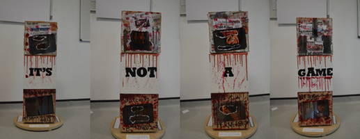
I would give the first piece 95% an A* because it looks very detailed and it has a very sleek presentation and i think that the way it looks is at a top grade standard. I love the way the blood has been drawn in a way that it looks scary and as though blood has been dripping down. The material used (cardboard) works perfectly, I especially like how the three cubes of cardboard moves if you spin them around. This sophisticated piece has a word on each of the 4 sides, 'Its not a game' this makes the piece look as though it is a horror from the words and the blood.
The close ups of the faces are covered with blood, this makes the piece demonstrate that this is a serious artwork presentation. The colors used are perfect because it meets the criteria of the theme. The depth of the creation is amazing and I found it very interesting because it looks something as though i would like to do.
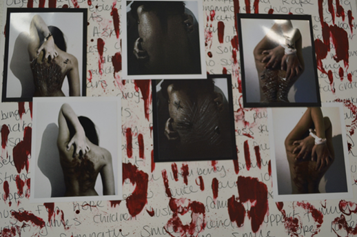
The 2nd piece of work with the bloody hand prints looks very eye catching! I would give this work 87 % a B+ grade. I especially like how the photos show different looks to the girls back in the photograph. This piece of work demonstrates a range of techniques and imaginative ideas. This is from the depth photographs and the writing in the background. There is a range of experiments shown by the pictures taken. The quality of the pictures are very high. I think that this is a confident presentation of ideas and a good analysis.
However this work can be improved! The piece as a whole looks very detailed but not very clear. The writing in the background for a start is very hard to read, this could have been improved by maybe writing in black ink to make the writing stand out and not look like a mess. Possibly a few more challenging ideas could have been useful and would have made the piece look more sophisticated.
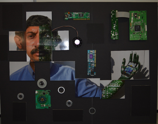
The 3rd piece of work looks creative and imaginative. I would give this 85% a B+ grade. The ideas are imaginative because the piece as a whole is something different in comparison to all the others. This contains a strong range of experiments. The photoshop used in this piece is outstanding and i think it has brought a very good effect to the work. I think that it is a confident piece of work and a good analysis. The materials used consists of a range and is very good!
However this work needs more depth. For a start the pictures are not in depth and high quality and this is partly because of the half electronic effect on the right hand side of the man. This piece overall looks fairly blank and not enough detail on the A2 paper. The arm that has the electronic effect doesn't fit in well with the man and it ruins the picture and doesn't look very professional, this could have been done much better. Also the shadow shows the man's face next to the arm whereas the face is looking straight in the actual picture.
The close ups of the faces are covered with blood, this makes the piece demonstrate that this is a serious artwork presentation. The colors used are perfect because it meets the criteria of the theme. The depth of the creation is amazing and I found it very interesting because it looks something as though i would like to do.
The 2nd piece of work with the bloody hand prints looks very eye catching! I would give this work 87 % a B+ grade. I especially like how the photos show different looks to the girls back in the photograph. This piece of work demonstrates a range of techniques and imaginative ideas. This is from the depth photographs and the writing in the background. There is a range of experiments shown by the pictures taken. The quality of the pictures are very high. I think that this is a confident presentation of ideas and a good analysis.
However this work can be improved! The piece as a whole looks very detailed but not very clear. The writing in the background for a start is very hard to read, this could have been improved by maybe writing in black ink to make the writing stand out and not look like a mess. Possibly a few more challenging ideas could have been useful and would have made the piece look more sophisticated.
The 3rd piece of work looks creative and imaginative. I would give this 85% a B+ grade. The ideas are imaginative because the piece as a whole is something different in comparison to all the others. This contains a strong range of experiments. The photoshop used in this piece is outstanding and i think it has brought a very good effect to the work. I think that it is a confident piece of work and a good analysis. The materials used consists of a range and is very good!
However this work needs more depth. For a start the pictures are not in depth and high quality and this is partly because of the half electronic effect on the right hand side of the man. This piece overall looks fairly blank and not enough detail on the A2 paper. The arm that has the electronic effect doesn't fit in well with the man and it ruins the picture and doesn't look very professional, this could have been done much better. Also the shadow shows the man's face next to the arm whereas the face is looking straight in the actual picture.
